This Month’s Featured Article

Getting It On At Chatham Brewing
 A story about beer labels seems almost silly and superficial in this crazy year. Surely there must be other things to think about? And surely there are.
Lots of other things to think about.
But a story about beer labels can reinforce the best kind of story there is at this challenging time when it’s a story about Chatham Brewing’s labels. Why? Because the labels are just one of the ways Chatham has stayed true to its local roots, to its investment in its community, and to its brand as a source of good beer and good times – and what’s better than that?
In the alley
It all started nearly 20 years ago, when the brewery was born in a garage down an alley along Main Street in Chatham, NY. It was the realized dream of Tom Crowell and Jake Cunningham, a couple of beer lovers who were introduced through their wives. As they slowly expanded, they were approached by home brewer Matt Perry, and it wasn’t long before he took their production to another level.
Customers could stop in for a draft on odd hours on the weekend, but they wanted growlers, too. And the beer had to be put in kegs. A logo was designed that took its inspiration from Chatham’s history as a train depot town – a crossroads. They added hops fronds, the letters C and B on either side, and “Chatham Brewing Chatham, NY” to form a circle around the image. Classic and clear.
A look and feel
Jordan Wolfe was also involved from the beginning. He’s their designer, and is a high school friend of Matt, now the head brewmaster. “They needed keg collars first,” Jordan told me when I asked about how he got started creating what is now an iconic look and feel for Chatham’s very popular beers.
“Then growlers,” he continued, “then bottling. It was a collaborative process from the beginning,” he said. “In fact,” he joked, “I’d love to give you a story about finding some deep inspiration for the design process, but it’s actually very nuts and bolts. Tom, Matt, and Jamie [Pilkington, Chatham’s marketing guru] come up with the names for the styles, and then they kick it over to me. I come up with several concepts, and we go back and forth til we all agree.”
“I’m a child of the 80s,” he offered with a hint of pride, “and I incorporate that into the look. For example,” he explained, “the Trop Hop label is ‘Miami Vice’ from the 80s, with palm trees against a magenta sunset.”
There’s a swagger to the label, like it’s beckoning you to partake. The description “a luscious lupine experience,” lets you know it’s hoppy, alright, but the logo splashing out on a slice of grapefruit tells you it’s fruity, too. “One of my favorite designs is the label for Bock & Bock,” Jordan explained, “which is essentially an homage to the cheesy cop shows from the 1980s, compete with hot rods and explosions – and the detectives have goat heads.” (‘Bock’ means goat in German).
No regrets
These guys have fun with things, and it’s obvious. One of their perennial beers is Czech’rd Past, a Czech-style pilsner whose label features a dark-haired bad-ass woman with bright red lips who’s blowing the smoke off a just-fired pistol. The description of the beer says, “From behind the iron curtain comes our Czech’rd Past. We’re not ashamed and have nothing to hide. No regrets with this classic Bohemian Pilsner. Served cold like revenge, it cuts to the chase. It’s the choice to make when you can’t afford any more mistakes in life.” Who wouldn’t want to try these beers?
When I talked to Tom Crowell about the labels and the company’s positioning in a very crowded craft beer marketplace, he acknowledged the competition and said, “We strive for a consistency of recognizability with our labels and our brand. The logo is always prominent. And we owe it to the consumer to make it clear what the style of the beer is and who made it. We want the design to complement the name and style.”
Variations on a theme
Tom talked about the labels for variations on a particular style, one of which is what they refer to as the “storm series.” The beers are Clippah, Nor’Easter, and Bombogenesis. All are double IPAs. “They all feature a stylized radar map of a storm,” he said, “and they play off each other.” It turns out Matt is a huge fan of storm systems, which is how the names originated. There are variations on variations, too, which is always a fun and flavorful thing. For summer, Chatham Brewing released a Mango Bombogenesis, which incorporated a mango’s colors of orange and green into the storm circles, and had images of swirling mangos, too.
The Ocktoberfest, a very popular seasonal beer, is another of Tom’s favorite labels. “It’s a Bavarian beer hall beer,” he said, “and the label definitely evokes what’s inside.” It features a colorful Bavarian harlequin pattern and a German-style coat of arms. “I like Hop Crop, too,” Tom noted, “for its evocation of grassiness, which is the nice green taste that that beer is all about.”
The message is enjoyment, for sure, but Jordan made clear that there is a necessary groundwork for the label design. All of the labels must include the logo, the name, and the style of the beer clearly stated on the front. “I like that in a wine store the wines are separated by their styles,” Jordan noted. “Beers tend to be grouped by brewery,” he added, which means you’ve got to jump around quite a bit to compare IPAs, for example. If the customer has to look too closely at the can to even determine the style, you may lose him or her.
Grounded in local
Jordan is a beer lover like everyone at Chatham Brewing, and he’s quick to point out that while a label is a selling point, the product itself is what people come back for. “Chatham Brewing makes great beer,” he said, “but I know it’s competitive and I do check out what others are doing in the marketplace. What’s important to all of us is staying relevant,” he noted. “We may not be the most contemporary, but we have a style.” Tom described it as “approachable mainstream.”
Mainstream, Main Street, Chathamites making Chatham beers, making them well and making them relevant. For its 10-year anniversary in 2018, Chatham had coasters and other promotional products printed with a 10 featuring the logo as the “0,” and proclaimed, “It’s not just local, it’s personal.”
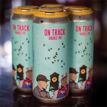
“We look around at what’s happening in town and in our area,” Tom added, “and we play with that sometimes. We came out with a beer called On Track this summer, and the label featured the graffiti artwork on a train car that’s parked near the Blue Seal store just outside of town. For the sesquicentennial of Chatham, we did a celebration beer featuring a Roger Mason painting of the iconic Chatham clocktower,” Tom continued. “And we’re doing one called Taconic State of Mind that will have that sculpture of the big white head that you see when you’re driving north on the Taconic.” •
Follow Chatham Brewing on Instagram and Facebook to keep up with their delicious selection of beers and scintillating label designs. Visit them at the brewery on Main Street, and look for their beers in stores throughout the state (and beyond). The brewery has done an amazing job of staying open and staying focused on safety throughout the pandemic, always with an eye on bringing great beer and a sense of solidarity to the community. Chatham Brewing is at 59 Main Street in Chatham. www.chathambrewing.com.